IPP logo and visual identity
for: Department of Plasma Physics
The Institute of Plasma Physics is a public research institution, part of the Czech Academy of Sciences. It deals with the study of plasma physics, related processes and their applications and research on controlled thermonuclear fusion.
Our task was to design a logo and visual identity for IPP that would represent this important institution well on the Czech and international scene. Of course, we also prepared a detailed graphic manual for the brand with all the necessary elements.
The meaning of the logo symbol
A plasma is an ionized gas consisting of ions and electrons and is formed by the removal of electrons from the electron shell of gas atoms or by ionization, i.e. by the breaking of molecules. This process is the direct inspiration for our logo and our entire identity.
The graphic abbreviation shows a stylized atom with one electron stripped off.In the background we use a graphic background to evoke the dynamic nature of the plasma.


The resulting single symbol in the IPP logo

The resulting single symbol in the IPP logo
Complete IPP logo
Complete IPP logo
The abstract illustration recalls the dynamic nature of plasma

Logo with complementary background motif
New brand identity on different apps
The logo fulfils its navigational role on outdoor surfaces
Facebook IPP

IPP Brand Manual

Clean logo style does a great job on a small format
IPP boards
IPP boards
Cover page of the IPP brochure
Selected graphic backgrounds work well online and on printed materials

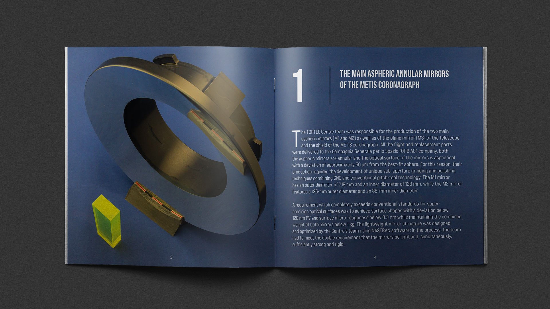
IPP brochure


The new identity in public space is sober and at the same time sufficiently expressive

Proposal for designation of the IPP building

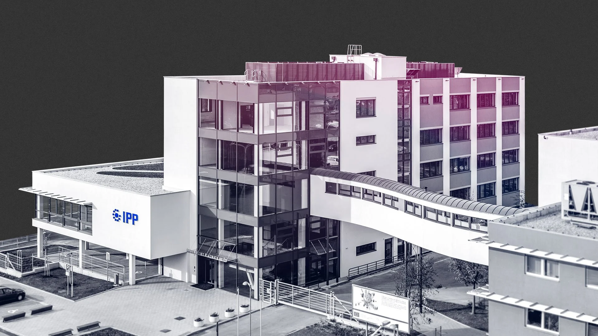
IPP logo on the facade of the Institute's building

The IPP logo on the facade of the Institute's building, the inscription of the Institute's name on the entrance and the IPP flag

Design with an eye for detail: even small navigation elements have their original look in the new identity


